Css Grid
Do you know (Layouting history)
The first web page went live on August 6, 1991. It was dedicated to information on the World Wide Web project and was made by Tim Berners-Lee. Then came tables in 1993, where we could give layout to pages, but it was very bulky to the DOM. In 1997, Divisions, a.k.a divs was introduced and made the layout more simpler with floats and semantic rich and lighter with DOM. But then alignment was a problem for adjacent divs. In early 2014 flex layout was introduced which is very powerful to do component layout-ing. But then flex was also one dimensional. Either we could layout things horizontally or vertically. But now with css grid, we could leverage a 2D way to layout things.
Getting started with CSS grid
Even though we have a lot of libraries for layout, they seem to add quite a lot of extra styles which is never required for a regular project. So what if we leverage browser capability to layout with a very few lines of code. And that is where CSS grid comes into picture.
Before diving into what and hows, let us understand a few key concepts for CSS Grid.
Concepts
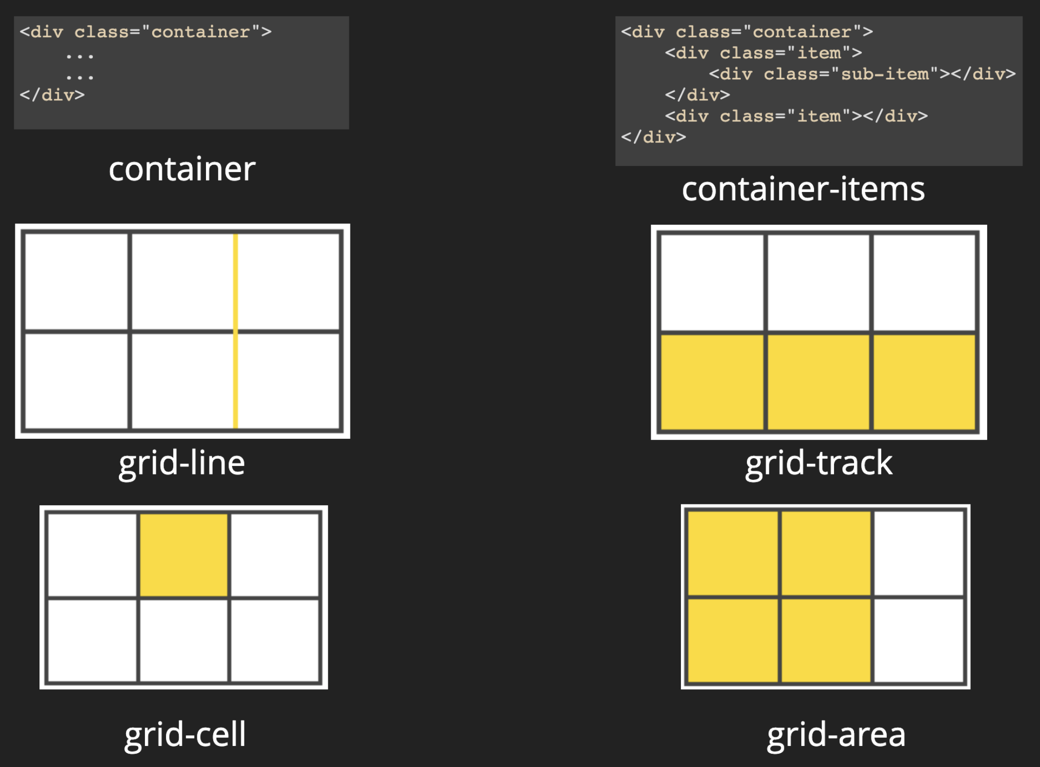
- Container : Like flex, we define a parent container where all its direct children behave as a grid element. And the container as a grid.
- Grid item : Immediate children to the grid container.
- Grid line : Separation of the grid cells. You could think of drawing table then the lines that you draw so that you mention the rows and columns.
- Grid track : The flow of cells in a direction, could be horizontal / vertical. This defines how the cells are going to be merged.
- Grid cell : Each cell in a row.
- Grid area : Combinations of cells. You could define a region with a name. A region consists of merged / unmerged cells.
Creating our first grid
.container {
  display: grid;
  grid-template-rows: 40px 40px 80px 80px;
  grid-template-columns: 130px 230px 330px;
  // grid-template-columns: repeat(3, 1fr);
  // grid-template-columns: 200px auto 200px;
  grid-gap: 20px;
}
Here, we defined our container as grid. This is to tell the browser that this container would behave like a grid. All its immediate children would be the grid elements. Then we define how many rows and colums we would require in the grid-template-rows & grid-template-columns. We specify the space between the cells with grid-gaps. See it is that easy. You could also use repeat and % values as well.
Making our grid responsive
By setting the minimum and maximum values we could let our grid decide when to break to the new line. You could see an example here.
.container {
  display: grid;
  grid-template-rows: 40px 40px 80px 80px;
  grid-template-columns: repeat(auto-fit, minmax(200px, 1fr));
}
Positioning our grid elements
One of the biggest advantage of having grid is that we could position our grid cells anywhere in the layout and other auto-adjust accordingly. This is done by specifying where to start and where to end. So without changing the html, you could now change the position of the cells. You could see an example here and here. This can be generally used to do a quick mockup or change to showcase / validate your idea.
Note : The grid lines start with 1 and not 0. -1 refers to the last grid line.
.aside {
    grid-col-start: 1;
    grid-col-end: -1;
}
Aligning the content inside the grid cells, are same as of flex. I would cover it in a next blog to keep it short.
Creating your own grid system
We could define a grid system for our project with a very few lines of code.
.container {
    display: grid;
    grid-template-columns: repeat(<no. of cols>, 1fr);
}
If you are using sass, them you could write a function for this
    @for $i from 1 through 12 {
      .col-#{$i} {
        grid-column-start: 1;
        grid-colimn-end: #{$i};
      }
    }


    @for $i from 1 through 11 {
      .push-#{$i} {
        grid-column-start: #{$i};
      }
    }
See a working example here
Bonus
We could create a image gallery using css-grid. Earlier we used to use a plugin to create the gallery. But now you could use css grid for the same. You could see the source code.
Hope you enjoyed reading and learning.